Making the best out of a bad situation

This nation-wide lockdown and quarantine sucks. 

We all know it does, this isn’t a unique thought or a bold opinion to have. We are all just sitting in our homes with nothing to do, while literally thousands of people around us die daily from a seemingly unstoppable virus. 

We are essentially living in Hell. 

But, even in Hell there are some bright spots, no? Well, at least for me there has been. Like most everyone right now, I have a newfound abundance of time at my disposal. I don’t have to go to work, go to class, go to band practice or play any gigs with my band right now or anytime soon. Because of this, I’ve found all sorts of new things I enjoy that I would have been too busy to discover before.

So for this reason, thanks COVID-19, I guess.

I listen to music all the time. If I’m plugging away at some schoolwork, driving in my car, playing video games or doing the dishes, I’ve got tunes playing in the background. But, I tend to get stuck in a loop of listening to the same 10 artists or so, and I’m normally too busy to be bothered to invest the time into finding new artists. When listening to an album or an artist for the first time, one must give the music your undivided attention – at least I do. 

Nowadays, I can do just that and I recommend everyone to do the same – branch out and break your typical music rotation, it’ll do you good. Just in the past 24 hours, I’ve found two new artists whom I love already – Shoegaze/Dream Pop bands Starflyer 59 and American Wolf. I cannot say I never would have found them without Coronavirus, but I’ve certainly found them sooner than I would have otherwise. 

But the new discoveries don’t need to stop with music. Over the past few years, I haven’t had the time to play video games like I did in my youth. Well, I sure as heck have the time now. I’m not encouraging anyone to sit and stare at a screen for 12 hours a day, but if you’re a fan – don’t feel guilty if you want to indulge a bit more than usual right now.

During this time, I’ve rediscovered my love for the ‘Doom’ franchise by beating “Doom 3” and the brand new “Doom Eternal.” I also recently jumped headfirst into a game I’d been meaning to play for quite some time – “Control.” Before the lockdown, I never would have been able to enjoy such time consuming games. 

For artists, this time can be rather productive. As a musician, I’ve been able to devote hours each day to songwriting. In that sense, the past 5 weeks or so have been great. I’m sure painters, and aspiring painters who never had the time to get started, are also utilizing this time to hone their crafts. Now, there’s nothing stopping you from picking up that guitar that collects dust in the corner of your room, or from putting pen to paper and writing a story or from tossing paint on the canvas and creating something beautiful. 

No one is happy to be locked in their house for the foreseeable future. We all want to get out and resume our normal lives. But, why not make the best of a truly awful situation while we can? It’s time to get more in touch with your artistic side and to enjoy the things that the grind of ordinary daily life kept you from.

VIDEO: https://youtu.be/eb2VgxNPjoc
Best Thing I’ve Read This Week (3/30 – 4/5)

ARTICLE: https://projects.fivethirtyeight.com/mortality-rates-united-states/

I was searching around the internet earlier today for articles that make good use of interactive media elements in their stories, and I stumbled upon several that caught my attention. The article I’ve decided to link here though, was certainly the most interesting. While it isn’t about the Coronavirus and pre-dates it by nearly 2 years, this article’s dark topic is unfortunately much more pertinent today than it was at its time of publication. As morbid as it is, we are completely surrounded by death at the moment – and death is exactly what this article is about. From FiveThirtyEight.com, the article I have chosen is an interactive map of the USA that shows mortality rates for leading causes of death in every U.S. county from 1980 to 2014

We’re all fascinated with death and what causes it to happen to those around us. This article lets you look at death, locally and across the entire country, under a microscope. The reader is encouraged to select from a large list of causes of death, the most common being cardiovascular disease and cancer, to see how each county in the country compares to one another in terms of deaths in the selected category. The statistics play out by deaths per 100k deaths. For example, cancer is ranked most common because out of every 100k deaths in the country, over 100 of those deaths will have resulted from cancer. Tuberculosis on the other hand ranks towards the bottom, as less than 10 deaths in every 100k occur because of Tuberculosis. One can then go into the map and hover over a specific county to view their statistics for any category of deaths for any year from 1980 to 2014. For example, Fillmore County in Nebraska has 13.3 deaths in every 100k deaths (I doubt 100k people die a year in that county, there must be some math and whatnot going on to make these numbers make sense, but that requires a smarter man than me) that happen because of self-harm. My home-county, Cattaraugus County (chest pound), unfortunately has more suicides it seems, with 13.8 deaths per every 100k being from self-harm. 

The amount of information in this interactive article is actually quite astonishing. If you want to know, for whatever reason, how many people died from AIDS per 100k in all of Utah in 1996, you can easily find that out – it was 4.5, by the way. Overall, I think this is a fascinating article – almost entirely because it allows the user to access and interact with unique and complex information in an aesthetic and easily digestible way. Below the map too, there is an entire written article. While it is interesting and written well, it isn’t even integral to the user’s/reader’s enjoyment of the article. It does provide some interesting charts regarding the places in the country that have the lowest and highest mortality rates, and surely that is good and worthwhile information to know, but who cares about that when you can see how many people died from car crashes in any random county in Florida in 1984? It may not be the most crucial information to know, but I certainly learned a lot from this article.

The Best Thing I’ve Read This Week (3/23 – 3/29)

Article: https://pitchfork.com/features/song-by-song/stephen-malkmus-traditional-techniques-interview/

Understandably so, all news is currently focused on COVID-19. I’ve obviously read and watched an awful lot of coronavirus coverage over the past week(s), but I wouldn’t consider any of it to be the best things I’ve read. I don’t read about the pandemic for pleasure, I read about it because I can’t avoid it and I, like so many others, am fairly frightened. But a few days ago, I stumbled across this feature of former Pavement singer-songwriter Stephen Malkmus on Pitchfork, where he discusses each track on his new album Traditional Techniques in depth.

Pitchfork features on artists are generally quite good, and I especially enjoy their articles of this type, where they have artists speak directly about specific tracks on an album. These articles don’t always focus on artist’s new albums either, as sometimes they will have an artist go back and dive into an album from their past – I can remember an outstanding article like this from a few years back where Paige Hamilton discussed his band Helmet’s critically acclaimed 1994 album Betty. These articles provide fans with a unique and in-depth look into the artist’s process, influences, and personal meanings behind their tunes. As a musician myself, I find this to be particularly interesting and relatable. While I am not a huge fan of Malkmus or Pavement, I still found this article to be very interesting. The lede set up the feature quite well, it described Malkmus and what he was doing, how he was acting, and the environment/setting during the interview. This provides the reader with a mental image of the tone and atmosphere of the interview and allows the reader to connect more easily with the material. The lede and nutgraf of the article, while brief, also personified Malkmus – specifically by how the writer describes him eating a muffin while lying on a couch. 

After three short paragraphs, the Q and A portion of the article begins. It is laid out very simply and clearly: The song title is listed (starting with track 1 and following the tracklist to the final song) and then the interviewer asks a question about the song and Malkmus answers it. Pitchfork’s questions are in bold, and Malkmus’ answers are not, making it very easy to read and understand. The article provides YouTube links of music videos of some songs from the album as well, so the viewer can listen for what is being discussed in the article. 

Overall, this is a lighthearted article that provides fans with an inside look into Malkmus’ new music and what it means to him and what he intends for it to mean to his listeners. It is a good example of multimedia elements aiding in a story. The music videos provided in the article not only allow the reader to hear the songs being discussed, but it may encourage people unfamiliar with the artist’s music to give it a try. I think articles like this are a great thing for both the music and journalistic worlds: They allow the musical artist a platform to answer questions that fans might have that wouldn’t be answered otherwise and, assuming the writer/interviewer is good, allows the artist to think of or address things they wouldn’t typically otherwise. Deep dives into an artist’s personal experiences with their music brings their fans closer to the music and humanizes artists who often seem larger than life. 

Empathize but stay distant: Surviving Buffalo News’ Criminal Justice Desk

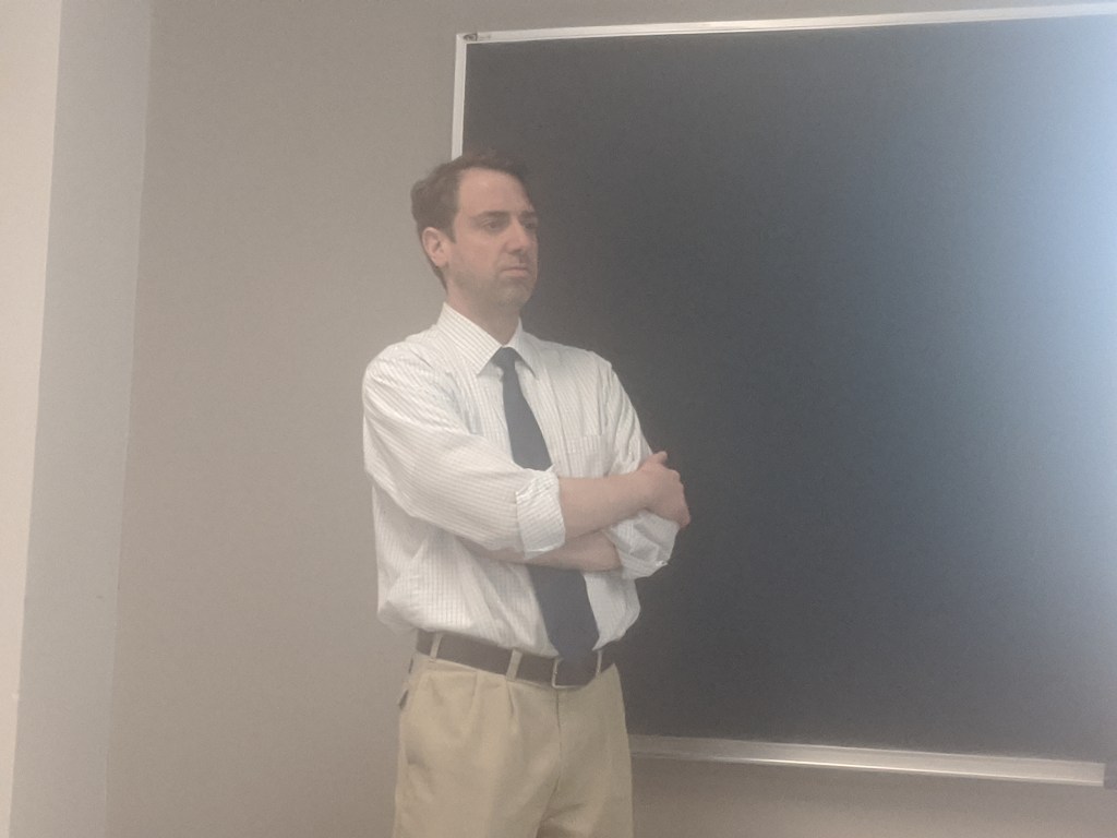
Aaron Besecker speaks during Keith McShea’s Digital & Broadcast Journalism class at the University at Buffalo on Monday, Mar. 9

Brutal, unsettling and unthinkable crimes occur everyday in Buffalo, and someone has to go to the scene to report on them.

That someone is Aaron Besecker, a criminal justice and breaking news reporter at The Buffalo News.

Besecker, a Western New York native and 2002 University at Buffalo graduate, started his journalism career with Niagara Falls’ newspaper The Niagara Gazette in 2004, where he covered news in Lewiston, NY. In 2007, he moved to The Buffalo News where he quickly found his journalistic calling working the crime beat. 

“Everyday is different and I definitely don’t get bored with it,” Besecker said. “I think that I am lucky to have a job where I like, really just love it.”

Reporting on criminal justice and breaking news is Besecker’s dream job, but many of the stories that he reports on would make the average Joe cringe, cry or quit. This line of work is not for the faint of heart.

Besecker is often sent to the scenes of gun violence, homicide, suicide or any other gruesome crime that occurs in the city and surrounding areas of Buffalo. Not only does he witness the unsettling crime scenes, but he speaks with the victims’ friends and family during which Besecker describes is “the worst day of their life, or close to it.”

“Sometimes you talk to people who’ve had their children killed or other loved ones horribly injured,” Besecker said. “So you have to take care when you approach people and ask them questions.”

It is only human to be affected by the things that Besecker sees, or the heartbreaking statements he hears from the people he interviews. But to be effective and objective, a journalist must not allow their emotions or bias to slip into a story. Besecker empathizes with the subjects of his reporting while remaining emotionally distant from them to ensure that his stories are nothing more than facts. 

“I’ve become better at staying apart from the subject matter,” Besecker said. “There’s some pretty devastating stuff that happens, you know? Like, it takes a lot to make an impression [on me] nowadays.”

Occasionally though, a story will hit The Buffalo News’ crime desk that is so heinous, even a seasoned veteran like Besecker finds it difficult to leave his emotions at the door. 

“A couple months ago there was the trail of the girl who got burned outside of Tim Hortons by her boyfriend. She was, like, horrifically burned,” Besecker said. “She was in court testifying… And it was really just tough.”

One way Besecker keeps himself sane while dealing with his job’s heavy subject matter, is by not taking his work home with him. Besecker uses his days off to decompress and relax.

“You’ve got to balance it. I couldn’t do my job and never turn it off when I get home,” Besecker said. “I work hard when I’m [at work] and when I’m not there, if I hear something I’ll let an editor know or someone else know who’s [at work]. But I just can’t, it’s not good personally to always work.”

 While Besecker loves his job at The Buffalo News, he recognizes that journalism and journalism careers have been on a steady decline for many years. 

“There are a lot fewer jobs than there used to be,” Besecker said. “ When I got hired by The Buffalo News [in 2007], my editor said she thought that I would be the last full time reporter hired by The Buffalo News. That turned out to be true.”

Despite the brutal crimes Besecker covers on a daily basis and the future of journalism being uncertain, his passion for his line of work continues to motivate him. 

“The greatest satisfaction is when you write a really good story. Just that feeling, that is what drives me,” Besecker said. “I don’t want to think about [changing careers]. I want to stay in journalism.”

Ken Burns PBS documentary “East Lake Meadows: A Public Housing Story” premieres at WNED in Buffalo

Ken Burns’ new PBS documentary depicts public housing in America as a racist institution that has kept society’s most marginalized people segregated, silent and in a perpetual state of poverty.

The voiceless families who have long suffered at the hands of state and federal housing authorities have been granted a voice to share their stories in the film. 

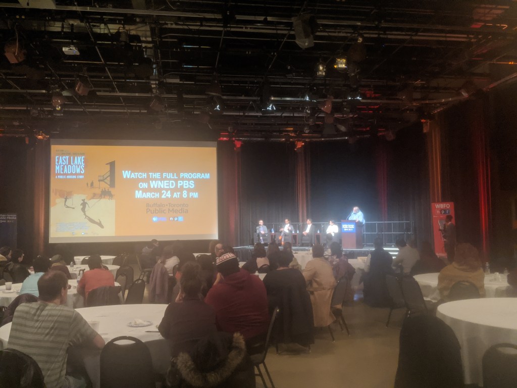
On Wednesday, PBS affiliate WNED hosted an abridged screening of its new documentary “East Lake Meadows: A Public Housing Story”. The film details how African Americans have been historically forced into concentrated poverty areas and how the United States government has done little to remedy the situation. This story, which rings true in Buffalo or any city in America, is told through the recounts of past residents of East Lake Meadows in Atlanta – a 650 unit public housing complex. Roughly 100 viewers attended the screenings in WNED’s banquet center.

The film follows the history of East Lake Meadows from its construction in the 1970s to its crime-ridden and unkempt existence in the 1980s and 1990s, when it was referred to as “little Vietnam”, until its demolition in 2005. After the complex’s destruction that forced out residents, many families weren’t allowed back into the newly constructed village in favor of higher income white families, after being promised by housing officials they could return. 

In addition to highlighting the poor quality of living and racism low income minorities face in public housing, “East Lake Meadows: A Public Housing Story” raises questions about how we can prevent similar situations in the future. 

“I think there are stigmas that are attached to the people who live in public housing.  I think that’s true in Atlanta and true everywhere,” said David McMahon, creator of “East Lake Meadows: A Public Housing Story.” “ So our efforts with the movie were to find people who could tell their stories.  You could tell it as a story about statistics, or you could go and put a human face on it.”

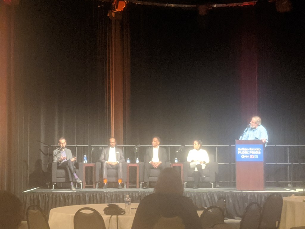
From left to right: David McMahon, Dr. Ron Stewart, Ronaldo Graham, Veronica Hemphill Nichols

After the 45 minute screening, a panel consisting of McMahon, Dr. Ron Stewart (Buffalo State Sociology Department Chair), Ronaldo Graham (BMHA 10 Council) and Veronica Hemphill Nichols (founder of the Fruit Belt, McCarley Gardens Housing Task Force) spoke about the film and how it relates to public housing in Buffalo.

Nichols described how low income families in Buffalo are currently being similarly forced out of their housing through gentrification.

“[McCarley Gardens] ownership in the past has tried to sell McCarley Gardens to UB, which took us four years to fight them and push them back,” Nichols said. “ Right now in Pilgrim Village there are systematic evictions, illegal evictions. The tenants are too afraid to step forward.”

The tragic story of East Lake Meadows is not unique to the past or Atlanta, as gentrification and unjust treatment of minorities is still commonplace in  America. 

“When it comes to these developments, this is what they want to do. When you talk about tearing down East Lake Meadows, that happened with Town Gardens [in Buffalo],” Nichols said. “They tore all of it down and built some beautiful units, you know, and only a fraction of the former tenants were able to come back.”

The events depicted in the film point to lingering racial issues in America.

“I do think the movie is sort of like a microcosm of what is happening in America,” Stewart said. “It is seemingly a national policy that people in power, particularly I would say white males, get in a room and decide what they want to do with people of color.”

Ultimately, “East Lake Meadows: A Public Housing Story” exists to set the record straight by providing viewers with the truth from marginalized and silent groups.

“So often the people who have the largest megaphone, and the deepest pockets are the ones who get to tell the story. And that’s how the narrative gets shaped, and those narratives get embedded, and then that becomes history, and that becomes what’s taught,” McMahon said. “It’s important to us that we go back and look at a story and say, ‘whose voice hasn’t been heard?’”

According to the storytellers and experts in the film, as well as the panel at Thursday’s screening, gentrification, racism and white greed are still rampant in cities across America. 

“The parallel is just so amazing,” Nichols said. “It’s happening to us right now, we’re in the midst of this battle. Honestly, I’m not going to accept that outcome for Buffalo.”

“East lake Meadows: A Public Housing Story” will be broadcast in its entirety on Tuesday, March 24 at 8pm on WNED PBS, according to WNED’s website.

VIDEO

The Best Thing I’ve Read This Week (2/24 – 3/1):

Article: https://www.npr.org/sections/goatsandsoda/2020/02/28/809580453/just-for-kids-a-comic-exploring-the-new-coronavirus

It has been difficult to escape hearing about the Coronavirus in 2020. Seemingly every time you turn on the TV, tune into the radio, open up the newspaper, scroll through twitter or fire up your web browser you are met with new statistics or stories regarding the disease. The issue has become so saturated that for many, or for me at least, any information on the topic is now disregarded. You’ll see it and think “oh, this again.” It just goes in one ear and out the other. We’ve all seen it all too much.

But, earlier today I stumbled on this NPR article that discusses the Coronavirus from an unusual perspective (I’ve linked the article above). The article highlights an important issue that has gone overlooked: What should kids know about the Coronavirus? It’s a simple question with a complex answer, because we aren’t kids. For a child, hearing about the Coronavirus during the news’ sensationalist stories or at school from classmates who also don’t fully understand it could be quite alarming and scary. A child’s mind could run rampant with doom and gloom with all of the information floating around about this disease. So, what do they need to know? This article, using information from experts at LSU, University of Illinois and the National Institute of Mental Health, addresses what kids need to know about the virus to protect themselves from it and to ease their worries. That sounds great in theory of course, but how are you going to get a kid to read a boring article on NPR about the Coronavirus? I’m an avid reader and even I am yawning just thinking of doing that. NPR did something genius here to combat children’s short attention spans: They turned the information into a fun, colorful, educational and easily digestible comic strip. Heck, I even found it infinitely more enjoyable than your average wall of text Coronavirus story. I also learned a thing or two.

A succinct lede, followed by three very short paragraphs, preface the Coronavirus comic. And that is it. The reader now just has to scroll down through the attractive and lighthearted comic strip. There is not much to read in the comic either, as it only took me about 2 or 3 minutes, but it is chock full of important information for both kids and adults. For example, it highlights how most cases of the disease have been mild (and explains what ‘mild’ means in this context), what the symptoms are, that professionals are working to solve the issue and how you and your family are likely safe if you wash your hands. All of this useful information is presented at a 3rd grade reading level as well, so kids can easily understand it.

I think this is a great example of journalism adapting and utilizing multimedia to reach a new audience and to help people. This article and comic has the potential to make many kids feel a lot better about the Coronavirus epidemic, thus exemplifying the importance and power of good multimedia elements in journalism.

Snocross races bring business to Salamanca’s locally owned establishments

On Saturday night, Broad Street in the small city of Salamanca on the Seneca Nation’s Allegany Territory was consistently riddled with traffic, requiring law enforcement to direct the flow of vehicles coming and going.

Anyone familiar with Salamanca, or the Southern Tier of NY as a whole, knows how uncommon traffic of any sort is there. For most of the year, the Southern Tier is home to its residents and only them, but occasionally the area is host to an event that the rest of the country deems worthy of their presence. 

Friday night’s Snocross races at Salamanca’s Seneca Allegany Casino had the small city of Salamanca comparatively abuzz. 

The casino’s 8 floor parking garage and overflow parking lot were filled with patrons, forcing additional show-goers to park their vehicles down the road at the nearby Seneca Nation Administration Building and Cultural Center Museum. License plates of parked cars revealed that people from as far away as Kentucky, Michigan, Ohio, Ontario and Virginia made the trek to Salamanca to watch the races. 

As the snowmobiles zipped around the snowy track to the delight of the thousands of viewers braving the crisp 30 degrees winter air, ESPN production crews streamed the event live for the entire country to see.

Some of Salamanca’s local establishments, who rarely see outside business, reaped the benefits of the area’s increased traffic.

“We had to increase our delivery staff because of all the traffic,” said Brandon Woodmancy, Salamanca resident and delivery driver for local pizzeria Marino’s. “Late at night after the races, our dining room was full, too. And we delivered to all the hotels way more than we normally do.”

Attendees from the Southern Tier, while enjoying the races and the area’s unusual attention, felt the abundance of outsiders was beneficial. 

“I thought it [the snocross event] was pretty cool for something I’m not usually into or know a lot about,” said Limestone, NY resident Morgan Gleason. “I think it probably brings a lot of business to local businesses, especially the casino, for the weekend because there’s a ton of people who come here for the races from far away.”

The Seneca Allegany Casino is hosting the touring AMSOIL Snocross Championship for the 8th consecutive year, but has no involvement in the event itself, according to Christian Printup, Special Events Director for Seneca Gaming Corporation. 

“We actually have no involvement with snocross, other than supplying a couple of our guys to help them work cameras and make sure it’s streamed in the casino,” said Printup. “Our Hotel Sales Department sells snocross the space for the event. Snocross is very self contained.”

While the Casino only rents out its east parking lot and events center for the snocross races, the casino’s gambling floor, hotel, restaurants and bars see a large increase in business the two days the championship is in town.

Salamanca was the 6th stop in the eight-event series and is the furthest east city to host the races. With a population of roughly 5,500, Salamanca is the second smallest city on the tour, behind Deadwood, S.D. with a population of roughly 1,300. The next stop for the championship is Grand Rapids, Mich. on March 13 and 14 before concluding in Lake Geneva, Wis., March 20-22. 

VIDEO: https://youtu.be/uAkq70gKLzU

The Best Thing I’ve Read This Week (2/10 – 2/14)

ARTICLE: https://www.abc.net.au/news/2019-12-11/why-everything-you-thought-about-running-is-wrong/11775598

Once again, this week’s article comes from the Australian Broadcasting Corporation. No, I’m not particularly interested in Australia. I was reading my article that I chose for last week, when I stumbled upon this piece through researching the designer who created the graphs from the last article. This new article, titled “Why almost everything you thought about running is wrong”, features multimedia elements once again, but this time they are even more prominent in the piece. 

The article details the differences in running techniques between recreational runners and professional, or ‘elite’, runners. After reading the introduction and scrolling down, you are met with animations that take up the screen and begin to move – quite similar to Snowfall. These animations are of skeletons of the two runners in question in the piece. As you scroll, the animations remain on screen while nuggets of text scroll into frame. The information explains what is occurring in the animations, like how the elite runner leaves her leading foot on the ground longer than the recreational runner does. Without the animations to visibly represent what is being discussed, it would be very difficult, especially for non-runners, to understand this abstract information. Without the fun structure and interesting animated graphics, this piece would be a dry and boring article on a subject I couldn’t care less about. The addition of the multimedia elements not only shortens the piece and breaks up the walls of text, but it makes the information interesting and more valid. 

I learned quite a bit from this article, but this information is not all that useful to me. I’m not a runner, so I doubt I’ll ever get the chance to improve my form. But, I suppose that now I’ll know how to, thanks to this article. I’m sure I’m just repeating myself when I say this, but this just shows you how much a well structured article with multimedia elements can help a piece. It made me stick around and read the whole thing. If it didn’t feature a unique scrolling pattern and those running skeletons, I wouldn’t have made it past the lede. Also, graphics like this reflect on how much work was put into the article, and as a reader I respect that. If I can sense a story was just thrown together willy-nilly, why should I take the time to read it? Also, there was a lot of very ‘official’ sounding science in the piece. They had a sports doctor in the article, so the piece itself felt trustworthy. This of course ties in with modern sports journalism’s obsession with under-the-microscope sports science and analytics, and this article takes those ideas and presents them in a helpful and interesting way. Mostly though, I picked this article because I was impressed they got me interested in an article about running. That graphic designer they’ve got in the Australian Broadcasting Corporation is pretty darn good.

The Best Thing I’ve Read This Week (2/3-2/7)

ARTICLE: https://www.abc.net.au/news/2018-01-18/how-your-worst-fears-stack-up-against-reality/9277098

The best thing I read this week is this interactive article from ABC (Australian Broadcasting Corporation) News. This piece, titled “How your fears stack up against reality”, shows readers how most common fears are not nearly as scary as they seem. The writers exemplify this by presenting statistics that state how unlikely one is to die from common fears like spiders, falling or choking. The article goes onto describe how irrational fears originate in humans, and why certain fears are considered irrational to begin with. 

While the information in the piece is certainly interesting and entertaining, its interactive graphics are the highlight. Readers are to select three fears from a colorful and attractive list of twelve common fears. After clicking on three cutsey cartoon images that represent your fears, a new graphic moves into view that ranks your selected fears by how many Australians have died from them during 2007 to 2016, even providing an exact number. After roughly 5 seconds, this small graph fades into a larger and more comprehensive graph containing more causes of death, many of which weren’t available to be chosen as one of your three fears at the beginning. This larger list shows that common fears like creepy crawlies, fire or shark attacks are fairly irrational, as they result in much fewer deaths than less common phobias do. For example, skin cancer tops the list with 19,839 deaths versus 0 for spider bites. Scrolling down reveals a final graph that utilizes the cute cartoons once more. This final graph, titled “Australia’s worst fears”, shows which fears have been picked the most by readers. Road or rail crash leads the pack with 32,845 votes. 

I picked this piece because I feel that it really shows how important media material or interactive components can be to a story’s effectiveness. I probably wouldn’t have thought twice about this article if it had not featured such attractive and fun graphics that changed depending on my unique selections. Sure, the information itself is quite good and I did learn a thing or two – specifically how fears form in babies and how in 10 years not one person died from a spider in Australia (how is that possible?!). But the graphics and other multimedia elements in the article is why the information will stick with me. The interactive lists and how they started small and became more comprehensive was a fantastic way to visualize the content in the story in a memorable and easily digestible way.

The Best Thing I’ve Read This Week (1/27-1/31)

ARTICLE: https://www.livescience.com/hottest-exoplanet-melting-atmosphere.html

This is a Live Science article written by Senior Writer Brandon Specktor about a recent NASA discovery –  a truly one of a kind exoplanet. If you don’t know, an exoplanet is an identified planet that is outside of our solar system and in a planetary system of its own. This particular planet, referred to as “KELT-9b” is worthy of note due to its insanely high surface temperature. In fact, the article states that KELT-9b is the hottest exoplanet ever detected, at 7,800 degrees fahrenheit. That heat, to me at least, is simply inconceivable. When you stick your hand in your 350 degrees oven to pull out your freezer pizza, it is pretty dang hot in there, right? Well, imagine that heat, but multiplied over 22 times. Damn. 

The article goes on to state that the planet’s close proximity to its own sun not only leads to record setting temperatures, but it also makes time fly, comparatively to earth’s. One year on KELT-9b is equal to one and a half days here on earth. An animated .gif in the article visualizes the planet’s quick and short orbit around its sun. This .gif also features a visualization of the planet’s literally melting atmosphere, as the article describes. Researchers at NASA still have much to learn about this extraordinarily unique planet, as they battle the clock to discover its mysteries before its sun explodes …in one hundred million years. 

I felt that this article was the best I’ve read this week simply because it was unlike anything else I’ve read. Most of what I read revolves around sports, arts, and local news. I rarely read national or ‘political’ news, as I find it painfully boring – which, yeah, I know, everyone else does too. Almost all sports journalism right now, at least what I came across on The Athletic and Twitter, is focusing on either Kobe Bryant’s death or the Super Bowl – and I am not particularly  interested in either. I’ve been fascinated with space travel and space in general for as long as I can remember, so any stories detailing new space-related discoveries are very interesting to me. Especially discoveries as mind-blowing as this one – a planet so hot that it is perpetually melting its own atmosphere. I also felt that this article applied to our class, as it featured a well made digital element. The animation in the article really helps the reader visualize and understand the abstract concepts depicted in the article.

My Favorite Place on or Near Campus

For me, this was a rather difficult conclusion to come to for a myriad of reasons. First off, I’m not sure if there are any places on campus at all that I particularly ‘like’. The campus mostly feels plastic and fake – as if it is entirely secluded from the ‘real’ world. I can’t exactly put my finger on this feeling, but it just feels hollow. It is also quite busy and cramped which makes me feel anxious at times. Plus, why is every chair at UB immensely uncomfortable? It is ridiculous. For example, take the weird, post modern chairs in front of the Corner Cafe in NSC. What an atrocity. In addition to this, the campus is just horrendous, grotesque, and depressing to look at. Whoever designed the buildings and the overall layout ought to be shot. The only building that doesn’t make me want to vomit is Center For the Arts. Most of the buildings either look incredibly boring, or completely out of place. There is no consistent design language or any sort of unique character to be found in the architecture at UB’s North Campus. It is just a mish-mosh of bland and drab concrete and brick. Yuck. Again, excluding CFA, the interiors of these buildings are utterly lifeless as well. I want to spend as little time as possible in these awful structures.

Alright, so if I don’t have a favorite place on campus, that leaves us with the surrounding area of UB. Which is of course Amherst. So, once again, my options are pretty terrible to pick a favorite place. Let’s not lie to ourselves, UB North’s location is just horrid. Amherst sucks. It’s just massive roads, stoplights, and chain restaurants as far as the eye can see. It is heaven if you are a wealthy, upper middle class white family looking to raise your family free from those dirty people in the city. The area is absolutely devoid of culture, which again is depressing. Don’t get me wrong though, I love Buffalo and I love western New York. Growing up in Salamanca, NY, I viewed Buffalo as the crown jewel of the area, and I still do. But Amherst ain’t Buffalo. All the good bars, restaurants, music venues, museums, or anything interesting, are all in the city or just south of Buffalo. Want to do anything of merit? You’ve gotta drive 15-20+ minutes away. It is simply cruel that UB is placed on the island of Amherst.

However, if I could stop being so dramatic for a moment, I do enjoy quite a few places in the Amherst area. One that immediately comes to mind is Elmo’s. I’ve been a wing enthusiast for as long as I can remember, and in the years I’ve attended UB I’ve made it to most of the acclaimed wing joints in the greater Buffalo area. Elmo’s recieves my vote for best wings in the area. Their hot wings have adequate heat, which is rare even in Buffalo, and are consistently the crispiest around. But the flavor that will truly rock your socks off is their honey mustard cajun double dip. Sure, you’ve gotta pay a bit more for the ‘double dip’ variety, but let me tell you – it’s worth it. I won’t say anymore about them. If you are a wing guy – and if you aren’t then go to hell – these will instantly be among the best you’ve ever had. In addition to their stellar food, I also love the atmosphere inside. It’s poorly lit, rather dingy, very outdated, and not attractive to the eye at all. I love it. It just feels real and authentic, like they weren’t trying to be or emulate anything. As if the owner says, “Eh, I don’t give a damn. My wings are good enough”. I respect that mentality. Sure the prices are fairly high, like any Buffalo area establishment. But at least with Elmo’s, what you pay is entirely worth it. Yet again, I’m from Salamanca, where food, and everything else, is comparatively dirt cheap. Who’d’ve thought that mass poverty would lead to good and low prices? Lastly, Elmo’s has always had great service during all of my visits. It always seems to be the same guy waiting on me and my pals. He’s about 5’10 or so, bald, and dons a disheveled Bills jersey of a player who’s been off the team for years – like CJ Spiller or other (which adds to the experience tenfold). He’s great and I always love leaving him a healthy tip. 

Right, so if I had to pick a favorite place on or near UB’s north campus, I’m going with Elmo’s. I’d go every week if I wouldn’t certainly suffer a heart attack by the age of 30 as a result. A visit to Elmo’s once a month will suffice.

Create your own website, free on WordPress.com.Create your own website.
Start free